When Washington, DC-based lawyers Rachel Rosenfeld and John Marsh moved from a condo in the city to a 1990s brick colonial in Bethesda, Maryland, they were craving more than just extra square footage—they wanted a place that felt like home. They enlisted the help of interior designer Liz Potarazu of LP & Co. to help them transform the outdated 5,300-square-foot home into a space that balances peace and play. "When Rachel envisioned her family’s home, she knew exactly what she wanted: a space that felt peaceful, but never dull—a haven where kids could be kids, and grown-ups could still find calm," Potarazu shares.
With two small children, safety and durability were non-negotiable. “I wanted it to be kid-friendly without sacrificing serenity,” Rosenfeld says. “A place where laughter echoes, but there’s still room to breathe.” Potarazu took a neuroaesthetic approach to the home's design, which she describes as being intentional about how a space makes you feel. "We think about color, texture, and light the same way we think about furniture—they all play a role in how you function in a space," the designer says. Here, that meant creating a calming and restorative primary bedroom, a lively and social dining room, and everyday spaces that help life flow more smoothly. "It’s design that supports how you live, not just how it looks," Potarazu says.
Take a tour through this beautiful yet deeply livable Maryland home where every design decision supports wellness, connection, and functionality for the family of four.
Living Room
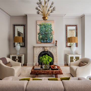
The living room is long and narrow, so Potarazu divided it into two zones: one main seating area and a secondary space with deep orange wingback chairs. The addition of ottomans keeps the room flexible so it can shift depending on how it's being used. "The clients wanted a space that felt special enough for entertaining but not off-limits for everyday use," Potarazu says of the living room.
Throughout the design process, she uncovered the homeowners' love for bold color, playful art, and layered texture. "The clients have a strong point of view with art, which I always appreciate," Potarazu says. "They love modern, colorful, abstract pieces and that contrast against the traditional bones of the house really works." To allow the art and materials to stand out in the living room and throughout the rest of the home, Potarazu used Benjamin Moore's Classic Gray as the main wall color.
Dining Room
Since the dining room is one of the first spaces you see when you enter the home, Potarazu wanted it to make an impression without feeling overly formal. "We mixed traditional moldings with a more modern chandelier and bold artwork, then grounded everything with a natural sisal rug," the designer shares. With small children in the mix, she says everything had to be family-friendly, no "look-but-don't-touch" pieces. The result is a space that blends dramatic modern artwork with clean-lined furnishings and layered textures for a visually appealing yet fully functional effect. "It’s beautiful, but you can still serve pizza there without panicking," Potarazu says.
Kitchen
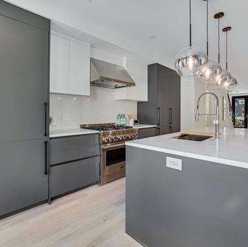
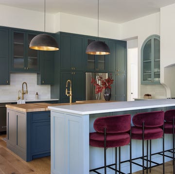
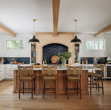
The biggest challenge when it came to the kitchen renovation was the layout. "It’s surprisingly narrow for a home this size, so creating an island that allowed for seating and still felt open took some work," Potarazu says. She optimized the layout to improve the kitchen's flow and functionality, and anchored the space with an island that seats four. For a timeless backdrop, the designer selected custom cabinetry in warm wood and soft neutrals, and to add depth and visual interest without overwhelming the space, she chose stone countertops with subtle veining and sculptural pendant lights. “I wanted the whole home to feel calm—no visual clutter, no chaos,” Rosenfeld says. Thoughtful design choices such as a soft color palette and smart storage solutions transformed the outdated kitchen into equal parts functional workhorse and design showpiece. "Now it feels light, clean, and intentional: true livable luxury, not 'pretty but impractical'," Potarazu says.
Sunroom
The sunroom is one of the most relaxing rooms in the house, and Rosenfeld's personal favorite. "It’s where I go to recharge, read, or just watch the light shift throughout the day," she says. Made up of three walls of windows, the sunroom is light, bright, and peaceful. "When the sheers are drawn, the light is filtered just enough that it feels so inviting, perfect for an afternoon nap or coffee break," Potarazu says. She incorporated biophilic design through a tall plant that connects the interior with the lush greenery outside.
"The clients are both busy professionals with demanding jobs, and they wanted their home to feel calm and organized, a place to actually relax," Potarazu explains. They liked the idea of an "organic modern" look, even though the house itself is a very traditional brick colonial. "We didn’t want to fight that, so we found ways to layer in the organic textures and neutrals they loved without losing the home’s character," the designer says. In the sunroom, that meant creating a layered look with a rug, plenty of upholstered seating options, a sculptural coffee table, and sheer floor-to-ceiling curtain panels that frame the views. "It’s a space that perfectly captures the home’s essence: tranquil, yet full of life," Rosenfeld says.
Powder Room
"The powder room was our chance to have fun," Potarazu says. The designer leaned into color and selected York’s Impressionist Floral Wallpaper, whose abstract print is juxtaposed with a clean-lined wood vanity and oval mirror. The statement powder room makes for an element of surprise and a memorable design moment. "It’s small but bold, one of those spaces that makes people stop and smile," Potarazu says.
Family Room
The goal for the family room was a comfortable space to watch TV that still looks elevated. When the homeowners purchased the property, the family room had an old wood-burning fireplace that felt heavy and dated, not to mention a safety concern given their two young children. "We rebuilt it using fluted tile and converted it to an electric insert," Potarazu says. What was once a forgettable stone fireplace is now a stunning focal point whose textural makeover puts a contemporary twist on a classic hearth. In addition to the space being safe and kid-friendly, durability was a high priority. "Everything in the room is made with performance fabrics and durable finishes so it can handle daily life," Potarazu shares.
Primary Bedroom and Bathroom
The primary bedroom has a large footprint and is filled with natural light that streams in through arched windows, which Potarazu says is beautiful, but tricky when it comes to window treatments. "It took several tries to find the right solution, but we landed on motorized sheers and blackout drapery that layer perfectly," she shares.
As for the primary bathroom, Potarazu says the original layout didn't make sense: "A '90s massive sunken tub and a tiny shower." The solution? Flipping the two. "Now it feels like a spa, with a freestanding tub and large shower lined in textured tile that brings in that organic feel," Potarazu says.
Kids’ Bedrooms
The two kids' bedrooms were designed to grow with them. "The daughter’s room was designed before she was even born, so flexibility was key," Potarazu shares. Pops of pattern appear in both of the kids' rooms and add a playful dose of personality, through checkered bedding in one, and a floral wallpaper in the other. "They’re sweet and age-appropriate, but not babyish," Potarazu says.
Maria Sabella is a lifestyle writer with a passion for home and interiors — from paint colors and holiday decor to the latest design trends. Her work has appeared in outlets including Better Homes & Gardens, The Spruce, BuzzFeed and Bustle.


